Script
Hello! Thanks so much for coming out today. We really appreciate it. How’s your day going?
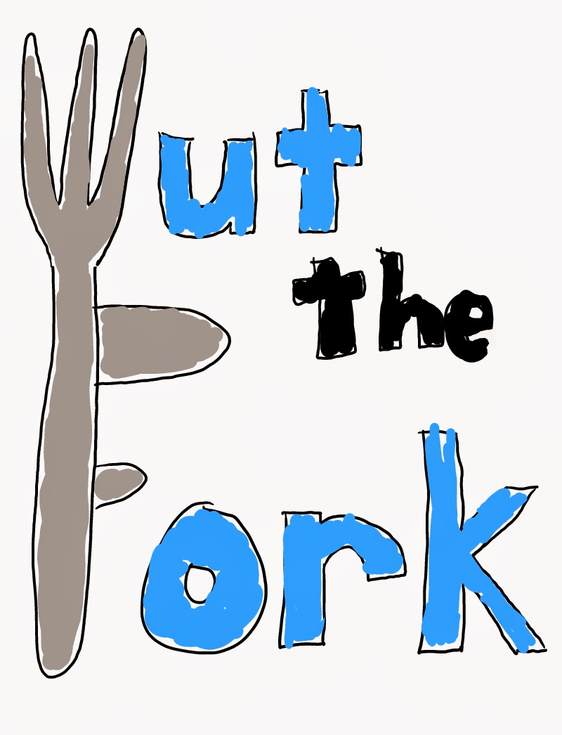
I work for Wut The Fork, and we’re testing out a new website to find out how well it performs.
Although this is called a usability test, don’t worry- you are not being tested. We are testing how well the website performs, so you can’t be wrong today.
I want you to know that I am not the designer, so please feel free to speak freely and honestly.
I encourage you to think out loud. This will help me to understand your thought process better.
So first, I’m going to have you take a look at the homepage.
When you first look at this page, what do you think is the site's purpose and the purpose of the business?
What do you think the main sections of the website are?
If you were visiting this site, where would you start? What would you do first?
Q1: If your parents are coming into town and you want to find a restaurant with an outdoor patio, live music and happy hour specials, how would you find your options that meet these criteria?
Q2: Imagine you own a restaurant and would like to create a new business profile on our website. How would you go about doing that?
Q2: Imagine you are a bar owner and you’ve decided to change your happy hour schedule. How would you update that information on our website?
Follow-Up Questions:
*Chance to ask why they did certain things the way they did.
Our site aims to be an all-inclusive resource where people can find all the information they need about bars and restaurants in Columbus using search terms to find exactly what they’re looking for.
Did you understand this purpose after using our site?
Could you foresee any instances where you might need to leave our website to find the information you’re looking for?
User 1: Results
If the user wants to be able to search for a restaurant/bar by name, then there should be a search bar that is easy to find with a clear purpose. (this will be reflected in our final prototype)
User 1: Results
If the user wants to be able to search for a restaurant/bar by name, then there should be a search bar that is easy to find with a clear purpose. (this will be reflected in our final prototype)
If the user is unsure of what is meant by "log in", then perhaps that needs to be better expressed. For example, "business owner log in".
If the user wants to save places for later, then there should be functionality for them to do so. (Because of time restraints, we have decided we can't fully add this functionality and will stay with the more basic usage).
Overall, this user hit on a lot of the same issues and problems that our in-class users mentioned. This is due mainly in part to the fact that our classmates fall within our target user demographic. Many of these issues have been resolved for our final prototype, with only a few being left as-is due to time and talent restraints. Color and design should also help make some of these tasks more clear.
User 2: Results
If the user wants to search for a bar/restaurant by search terms then they are able to use the search box options on the main page.
If the user wants to search for a specific restaurant directly, for example to see if it has live music that night, then there should be an obvious search box located on the main page.
If the user is confused about the log-in and create accounts links, then these links could be more specific or combined into just one link for logging in and creating an account.
If the user does not immediately recognize the purpose of the site when arriving at the main page, more food and drink related images or a tag line briefly explaining the site can be added tot he front page.
After completing the usability tests, our second user generally did not have many problems navigating the site. They did however, encounter some of the same problems experienced in our other usability tests. These problems were easy to correct, for example adding images and icons to make the purpose of the site more clear, and we believe many of them have been resolved in the finalized version of our click-able prototype.
User 3: Results
If the user is unsure what the purpose of the site is within a reasonable amount of time on the home page, then implementing images and hierarchy could help inform the user of the purpose of the site.
If the user wants to find information on a specific restaurant or bar, then we must be sure to include a search box or keyword entry box in our search graphic.
If the user is confused between the top navigation and the side navigation, then adding more functionality, hierarchy, or content could help clear up confusion regarding the purpose of each navigation bar.
This user was able to navigate the site fairly easily generally, but had some issues with identifying the purpose of the site at first. They were unsure about what the site's goal was, and at first only knew it had to do with searching something. They had a few problems with understanding the graphics, especially with the lack of a keyword box in our search box. Revisions on the graphics should help clarify and fix these issues. There was also a bit of confusion about what the purpose was of having two "navigation bars", especially since the left bar seemed to overlap a bit with the main search box's purpose. This was a problem we had previously encountered, and should be able to be solved. Using functionality might help us to suggest the purpose of the side bar, while clearing up links in the top navigation might clarify what other page options there are.
In-Class User: Results
• User was unsure of why a search bar would be necessary
• User did not not think that links for businesses should be in the top navigation bar
• Purpose of site was not apparent as quickly as it could be
• User really liked quick links/lists on the side where she could quickly see what's open now, trending, etc.
• User realized that on the "create bus. profile page" - there's no place to create a username and password, so how can you log in to edit your page
• User did not know how to submit her own bar/restaurant review
• User was concerned what a bar/restaurant owner would do if their musical acts/specials change from one week to the next
If the user is unsure of the purpose of a search bar, perhaps the location of the search bar doesn't make the most sense for usability purposes.
If the user is not a business owner, then they may be confused/frustrated by the business-related links at the top of the page. May want to move those links to a different location.
If the user is unsure of the site's purpose, then a slogan would be helpful that gets the purpose across at a glance.
If the user really appreciates the quick links, then we should keep those as is or make them even more prominent on the page.
If the user is unable to create a username or password, then we need to add a section to the 'create profile page' where they can choose a username/PW.
If the user wants to submit reviews but doesn't know how, then we need to add a 'write review' button to the site. Probably in the same area as the other reviews, or possibly it's own nav link as well.
If an owner has changing specials/music and doesn't know how to express that on their profile, then we need to have an 'upcoming events' section where they can add non-recurring events/specials.